 By Vance Neely
Curb appeal is a powerful variable in the real estate market, functioning as the ultimate first impression for potential buyers. Before an individual ever steps foot inside a home to inspect the updated kitchen or admire the spacious floor plan, they form a subconscious opinion based entirely on the exterior aesthetic. Studies in real estate marketing consistently demonstrate that well-executed exterior improvements can significantly yield a higher final sales price. Among these improvements, applying a fresh coat of paint remains the single most cost-effective project a homeowner can undertake to increase property value.
However, selecting an exterior color scheme requires a strategic mindset rather than personal indulgence. Highly unconventional or overly personalized choices can alienate buyers and drive down offers. To maximize equity, homeowners must focus on sophisticated, market-tested hues that accentuate architectural lines, harmonize with the local landscape, and project a sense of enduring maintenance. The following seven exterior paint colors have a proven track record of boosting market desirability and property valuations.
1. Sophisticated Greige
A harmonious blend of gray and beige, greige has established itself as an absolute powerhouse in residential real estate. This color succeeds where traditional hues occasionally stumble. It avoids the clinical, overly sterile appearance of a true industrial gray while successfully dodging the dated, yellowing undertones found in basic mid-2000s tan or beige.
Greige functions beautifully across varied geographic regions and diverse climates. Under bright, intense sunlight, the cool gray undertones emerge to keep the property looking crisp and modern. Conversely, on overcast days or under shaded tree canopies, the warm beige base tones provide a welcoming sense of comfort. Realtors frequently favor this hue because it allows potential buyers to easily superimpose their own stylistic preferences onto the property, creating a neutral canvas that highlights landscaping features.
2. Off-White and Warm Cream
While a bright, stark white can look excellent on specific ultra-modern or farmhouse-style homes, it often produces an uncomfortable glare in neighborhoods with minimal shade. To maintain a clean, classic appearance that stands the test of time, smart investors opt for off-whites, alabasters, and warm creams.
An off-white exterior makes a residential structure feel larger, cleaner, and more prominent on its plot. It acts as an exceptional foil for high-contrast accents, working flawlessly alongside matte black gutters, natural cedar porch columns, or dark bronze light fixtures. When applying cream or off-white, ensure the trim is painted in a slightly brighter, crisp white to give the home clear definition and prevent the overall facade from looking washed out or uniform.
3. Deep Charcoal and Iron Gray
In recent years, the real estate market has experienced a major surge in demand for moody, dark-hued homes. Deep charcoal, slate, and rich iron tones have moved out of niche architectural spaces and firmly into mainstream suburban markets. Buyers view dark, saturated exteriors as luxury choices that feel custom, intentional, and high-end.
Dark tones work exceptionally well on contemporary structures, mid-century modern designs, and traditional homes located in wooded or coastal environments. The secret to utilizing deep charcoal without overwhelming the property lies in balancing the contrast. Pair dark siding with light architectural details, such as a natural oak front door, crisp white stone masonry, or concrete pathways. This contrast keeps the building looking sophisticated rather than gloomy.
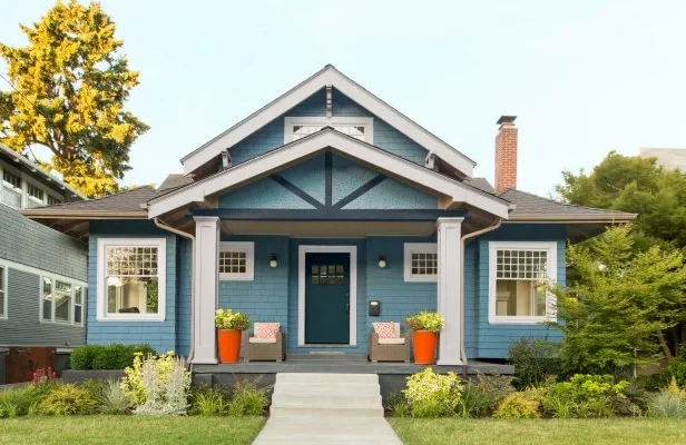
4. Mid-Tone Coastal Blue
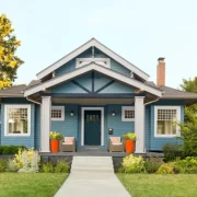
Blue is historically documented as one of the most universally liked colors across global demographics, and this preference translates directly into home buying habits. A muted, mid-tone blue with strong gray or slate undertones injects immediate personality into a neighborhood without creating an unwanted distraction.
Avoid bright primary blues, pastels, or royal blues, which can diminish the luxury appeal of a home. Instead, focus on historic maritime shades, steel blues, and dark slate tones. This color profile works wonders on traditional colonial homes, beach cottages, and craftsman bungalows. It pairs elegantly with white trim and dark asphalt shingles, giving the home an airy, trustworthy, and relaxing vibe that appeals directly to families.
5. Earthy Olive and Sage Green
As design trends lean heavily into biophilic concepts, which seek to connect human environments with the natural world, muted greens have become a highly sought-after option for home exteriors. Olive and sage greens with gray undertones ground a property, making it look as though it belongs organically within its surrounding landscape.
Earthy greens are especially effective for homes with visible brick elements, stone foundations, or extensive landscaping. The green tones naturally complement the red and brown hues found in masonry, creating a cohesive visual package. This color group suggests peace, sustainability, and tranquility, making it a highly effective choice for suburban properties and rural estates.
6. Saturated Navy Blue
Navy blue is a classic exterior option that bridges the gap between traditional safety and modern luxury. A true, deep navy functions almost as a neutral color, offering enough depth to hide minor surface imperfections while delivering a bold pop of style that stands out from a street filled with standard tan houses.
When a home is painted in high-quality navy blue, it commands attention and projects structural stability. To keep a navy home looking modern, pair it with bright white trim around the windows and rooflines. For a pop of welcoming curb appeal, finish the front door with a rich brass handle and a striking paint color like soft apricot, warm gold, or natural mahogany.
7. Taupe and Warm Stone
For homeowners who wish to steer clear of the gray color trend completely but still want a modern aesthetic that drives up property value, taupe is the perfect solution. Taupe is a dark, complex neutral that sits comfortably between brown and gray, mimicking the tones found in natural granite and river rock.
Taupe is highly favored by property managers and flippers because of its practical longevity. It excels at hiding airborne dust, dirt, and splash marks from heavy rain, allowing the house to look clean and newly painted for years. It establishes an upscale, estate-like presence that looks incredibly premium when paired with dark charcoal trim and bronze hardware accents.
Frequently Asked Questions
Does the gloss level of exterior paint impact the perceived value of a property?
Yes, paint sheen plays a major role in the final visual appearance of a home. For the main siding body, standard exterior flat or low-lustre satin finishes are ideal because they absorb light and hide surface dents, warped boards, and texture flaws. Semigloss paint should be reserved strictly for trimwork, shutters, and doors to provide a clean contrast and make architectural details pop.
How do I choose an exterior paint color if my neighborhood has a strict homeowners association?
Before buying paint, obtain the official architectural guidelines from your homeowners association. Many associations maintain an authorized palette of pre-approved colors to preserve neighborhood consistency. If your desired color is not on the list, you can submit a formal variance request with painted sample boards to show that your choice coordinates with the surrounding homes.
Can a specific front door paint color increase property value independently of the siding?
A contrasting front door color is a highly effective way to create a clear focal point for an entry. Real estate data shows that buyers respond favorably to front doors painted in bold, high-contrast shades like deep black, rich navy, or natural wood stains. These colors create a welcoming entry experience and elevate the perceived value of the entire facade.
Should my gutters and downspouts match the siding color or the trim color?
As a general rule, downspouts should be painted to match the siding color they run against so they blend in and disappear visually. The gutters running along the roofline can be painted to match either the trim color or the roof color to create a clean, continuous frame around the top of the structure.
How does the color of my roof impact the choice of exterior paint colors?
The roof represents a massive visual zone of your exterior and is expensive to change. Therefore, your paint choice must coordinate with your existing shingles. A black or gray roof works well with almost any paint color, including cool blues, whites, and grays. A brown, tan, or terracotta tile roof requires warm-toned paint options like cream, taupe, or olive green to avoid a clashing color scheme.
Is it necessary to paint the brick elements of a house to maximize property value?
Painting historic, high-quality brick is often discouraged because natural brick offers a timeless, low-maintenance surface that buyers value. If the existing brick is stained, mismatched, or visually dated, applying a breathable silicate-based mineral paint or a traditional limewash can modernize the facade while protecting the masonry’s ability to shed internal moisture.